Imagine reading a handwritten note that is felt and read—a message with emotional resonance due to its word flow—the magic of cursive typography. Cursive typography may make plain text stand out in digital or print design. How do you make captivating cursive lettering that stands out? This will cover cursive typography basics, its components, and how to assemble them. By the end of this book, you will know how to create beautiful, functional cursive typography.
What Is Cursive Typography?
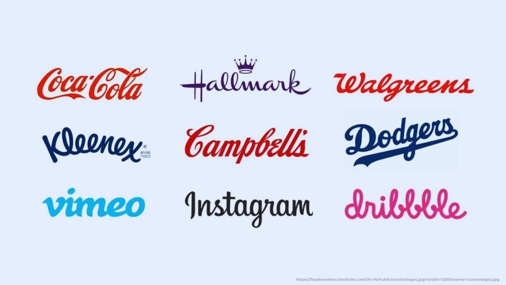
Cursive typography refers to a style of writing where the letters are connected, mimicking the flow of natural handwriting. This style is often used in logos, invitations, posters, and digital media to evoke a sense of elegance, creativity, or nostalgia. Cursive font is a popular choice for various design projects because of its fluidity, which gives it a unique capacity to portray emotion and individuality.
Why Use Cursive Typography?
- Emotional Impact: Cursive fonts can evoke feelings of warmth, sophistication, or playfulness, depending on the design.
- Visual Appeal: The smooth, flowing lines of cursive typography add a touch of elegance and make the text visually appealing.
- Brand Identity: Cursive typography can reinforce brand identity by reflecting the brand’s personality, whether it’s luxurious, casual, or artistic.
Key Elements of Effective Cursive Typography
Certain vital elements need to be considered to create compelling cursive typography. These elements affect the aesthetic appeal and ensure the text remains readable and functional.
1. Font Selection
Choosing the right cursive font is crucial. The font should align with the purpose and message of your design. For instance, a formal invitation might require a more intricate and elegant cursive font, while a casual event flyer might benefit from a more straightforward, playful typeface.
- Elegance: Choose a script font with thin strokes and intricate curves for a sophisticated look.
- Readability: Ensure that the font remains legible, especially in smaller sizes.
- Personality: Match the font’s personality with the message you want to convey. A whimsical font might not be suitable for formal content, and vice versa.
2. Letter Spacing
Kerning, or the spacing between letters, plays a significant role in cursive typography. The goal is to ensure that the letters flow smoothly into each other without appearing too cramped or too loose.
- Balanced Spacing: Adjust the spacing so that the letters connect naturally, maintaining a balanced look.
- Custom Kerning: For a more personalized touch, manually adjust the kerning to enhance the fluidity of the text.
3. Line Height
To maintain Readability in cursive typography, the distance between lines of text (line height) should be carefully considered. Too little line height can make the text look cramped, while too much can disrupt the visual flow.
- Optimal Line Height: Set the line height to provide enough breathing room for the text without breaking the continuity.
- Contextual Adjustment: Depending on the length of the text and the medium, adjust the line height to enhance the overall aesthetic.
4. Consistency in Stroke Width
In cursive typography, consistency in stroke width contributes to the overall harmony of the text. Irregular stroke widths can create visual confusion and distract from the message.
- Uniform Stroke Width: Choose a font with a consistent stroke width or customize it to achieve uniformity.
- Subtle Variations: If your design calls for it, subtle variations in stroke width can add a dynamic touch without overwhelming the reader.
5. Color and Contrast

Color and contrast are vital in making cursive typography stand out while remaining easy to read. The right color choice can enhance the emotional impact of the text, while appropriate contrast ensures visibility.
- High Contrast: To guarantee that the text is easily readable, choose a color that contrasts nicely with the background.
- Emotional Tone: Select colors that resonate with the mood you want to convey—warm tones for a friendly feel and cool tones for a more formal look.
Techniques for Enhancing Cursive Typography
After discussing the fundamentals, let us look at some tips that will help you improve the quality of your cursive typography.
1. Layering and Overlapping
Layering cursive text over images or other design elements can create depth and visual interest. However, ensure the text remains readable without getting lost in the background.
- Subtle Overlaps: Allow letters to overlap for a more cohesive look slightly.
- Background Blending: Adjust the transparency or color of the background elements to make the cursive text pop.
2. Textures and Patterns
Incorporating textures or patterns into cursive typography can add a unique touch, making your design stand out.
- Textured Fonts: Use fonts that already have texture built-in or apply texture effects in your design software.
- Patterned Backgrounds: Pair cursive typography with subtly patterned backgrounds to enhance the overall design without overwhelming the text.
3. Digital Effects
Adding digital effects like shadows, gradients, or glows can make cursive typography more dynamic and engaging.
- Shadows and Glows: Apply subtle shadows or glows to make the text stand out, especially in digital designs.
- Gradient Fills: Use gradient fills to add depth and dimension to your cursive typography.
Common Mistakes to Avoid in Cursive Typography
While creating cursive typography can be an exciting endeavor, certain pitfalls can diminish its effectiveness. Here are some common mistakes to avoid:
1. Overcomplicating the Design
It’s easy to get carried away with decorative elements in cursive typography , but too much can overwhelm the design.
- Keep It Simple: Focus on clean, readable text rather than excessive flourishes or embellishments.
- Balance: Ensure that decorative elements enhance, rather than detract from, the main message.
2. Ignoring Readability
No matter how beautiful your cursive typography is, it is only helpful if readable.
- Test Readability: Always test your design at various sizes to ensure Readability across different mediums.
- Clarity: Avoid overly complex fonts that might be difficult to read, especially for longer texts.
3. Inconsistent Style
Mixing different cursive fonts or combining cursive with non-cursive text can lead to a disjointed design.
- Stick to One Style: Maintain consistency in font style to create a cohesive look.
- Complementary Fonts: If you must mix fonts, choose complementary ones that enhance each other rather than clash.
Bringing It All Together: The Impact of Thoughtful Cursive Typography
Creating compelling cursive typography is both an art and a science. By understanding the fundamental elements and techniques, you can craft designs that are visually appealing but also meaningful and effective. Whether you’re working on a logo, an invitation, or a digital project, applying these principles will help you put it all together in a way that resonates with your audience.
Ready to take your cursive typography to the next level? Explore OCH , a creative digital marketing company that can help you bring your vision to life with expert design and marketing solutions. Don’t just create—captivate!


