Imagine sifting through a mountain of data, with numbers and figures scattered everywhere. It’s overwhelming. Finding insights and making informed decisions becomes a monumental task. A clear and captivating picture may be created from this data mess with the help of data visualization, a potent tool. Data visualization is the art of presenting information in a graphical format using charts, graphs, maps, and other visual elements. It’s the bridge between raw data and human understanding. By leveraging the power of images, businesses may get valuable insights, identify trends, and make data-driven decisions that result in success.
Why Data Visualization Matters for Businesses
In today’s data-driven world, businesses collect information on everything from customer behaviour to marketing campaigns. However, the actual value lies in extracting meaning from this data. Here’s how data visualization empowers businesses:
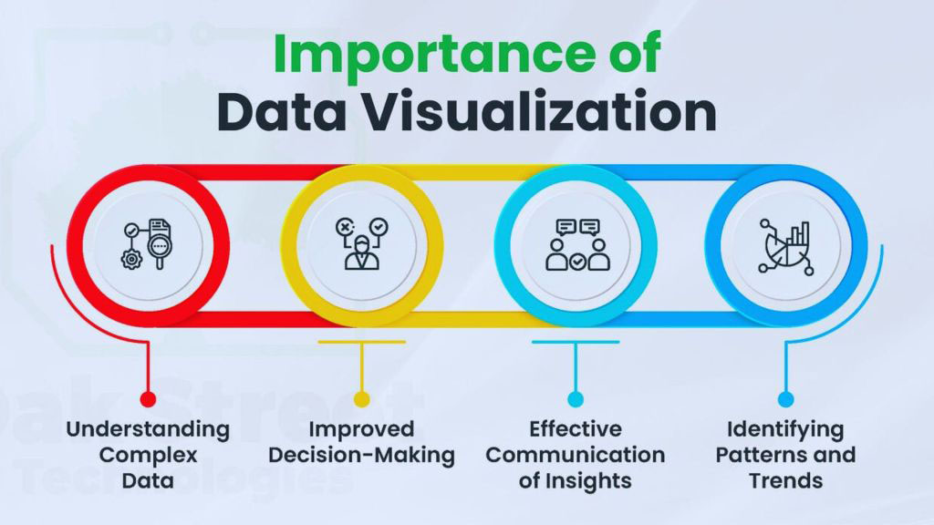
- Enhanced Clarity and Understanding: Data visualization simplifies complex information, making it easier to grasp trends, patterns, and relationships within the data. Imagine comparing sales figures across regions – a bar chart instantly reveals which region performs best.
- Improved Communication and Storytelling: A well-crafted data visualization can tell a powerful story. Complex reports become engaging narratives, allowing you to effectively communicate insights to stakeholders, regardless of their technical background. Imagine presenting customer demographics – a well-designed heatmap instantly conveys your target audience’s age groups and locations.
- Better Decision-Making: Data visualization empowers businesses to make informed choices. By spotting trends and anomalies visually, companies can make strategic decisions backed by clear evidence. Imagine analyzing website traffic data – a line graph shows peak traffic times, allowing you to optimize marketing campaigns for those periods.

- Increased Engagement and Retention: Visuals are inherently more engaging than plain text. Interactive data visualizations allow users to explore information at their own pace, leading to a deeper understanding and improved information retention.
Types of Data Visualization for Business Needs
Data visualization offers diverse tools to cater to different business needs. Here are some of the most common and effective types:
Bar Charts
Bar charts are perfect for displaying trends over time or comparing categories. They make it easy to compare data between categories by representing data values with horizontal or vertical bars . You can use a bar chart to see how different product lines are doing in terms of sales.
Line Charts
Line charts are perfect for visualizing trends and patterns over time. They use lines to connect data points, showing how a specific metric changes over time. For example, a line chart can track website traffic over a month, highlighting peak days and seasonal trends.
Pie Charts
Pie charts showcase how a whole is divided into its parts. They use pie slices to represent different categories, making it easy to see the proportional breakdown of data. For example, a pie chart can show the distribution of website traffic sources (organic search, social media, etc.).
Heatmaps
Heatmaps use colour intensity to represent data values on a grid. They are ideal for visualizing trends across two dimensions, allowing you to identify areas of high or low concentration quickly. For example, a heatmap can show user clicks on a website, revealing areas that receive the most attention.

Scatter Plots
Scatter plots showcase the relationship between two variables. They use dots to represent data points, and the position of each dot reveals the correlation between the two variables. For example, a scatter plot can show the relationship between advertising spend and sales.
These are just a few examples. The choice of visualization type depends on the specific data and the story you want to tell.
Choosing the Right Data Visualization Tool
With many data visualization tools available, selecting the right one can feel overwhelming. Here are some key factors to consider:
- Your Needs and Budget: Different tools cater to varying levels of complexity and offer different pricing models. Identify your specific needs and budget constraints before making a choice.
- Ease of Use: Consider your team’s technical expertise. Some tools offer a user-friendly interface, while others require programming knowledge.
- Data Integration Capabilities: Ensure the chosen tool seamlessly integrates with your existing data sources.
- Collaboration Features: If multiple team members will be working on the visualizations, consider tools that offer collaboration features.
Common Data Visualization Mistakes to Avoid
- Overcomplicating Visualizations : Don’t cram too much data into one visualization; it will overwhelm the audience and obscure the critical message.
- Misleading Color Choices : Use distinct, appropriate colours to highlight trends and differentiate data points.
- Inconsistent Design : For a professional look, maintain a consistent visual style (e.g., fonts, colours, and layouts).
- Neglecting Accessibility : Ensure accessibility for all, including high-contrast colours, clear labels, and alternative text for chart elements.
- Focusing on Style Over Substance : Prioritize clarity and functionality over aesthetics; avoid 3D effects and gimmicks that distract from the data.
Avoid these pitfalls to create data visualizations that are informative, engaging, and effective.
Creating Effective Data Visualizations for Business

While data visualization offers a treasure trove of benefits, creating clear, informative, and impactful visualizations is crucial. Here are some essential tips:
- Know Your Audience: Tailor your visualization to the needs and understanding of your audience. Avoid technical jargon and use clear labels and titles.
- Focus on a Single Message: Each visualization should tell a specific story. Avoid overloading charts with too much data, which can lead to confusion.
- Emphasize Clarity: Use transparent colors, fonts, and layouts to ensure the data is easily read and interpreted.
- Leverage Color Effectively: Color can be a powerful tool to highlight trends and differentiate data points. However, use colour strategically to avoid overwhelming your audience.
- Maintain Consistency: Maintain a consistent visual style across your visualizations for a professional and polished look.
Unveiling the Power of Data
Data visualization is a game-changer for businesses. By transforming complex data into clear visuals, companies can unlock valuable insights, improve decision-making, and achieve their goals.
Ready to unlock the power of data visualization for your business?
Contact OCH> today and schedule a free consultation with our data visualization experts. We’ll help you transform your data into actionable insights that drive success.


